December 13, 2020
“Lancets” are generally referred to in two different contexts: surgery and architecture. In surgery, a lancet is a small, broad, two-edged surgical tool with a pointed tip. In architecture, it is generally an arch, also with a pointed tip. These types of arches were common in Gothic architecture, and show up most commonly from 1100-1275AD. Both of these definitions hark back to the lance, a light throwing spear used in the late Middle Ages. Our newest design, German Lancet, we named after all these things, due to the pointed tip, and the 3D feel that the second color adds to the print.
Original design as found in Handbuch, Edgar Hennecke, Tübingen, Rohr, 1904.
We found this pattern in a German theology book from 1904. The publisher was Mohr Siebeck, an academic publishing group in business since 1801. Paul Siebeck, who was running the company when this book was published, retired only one year after the book was released, but he had significant influence on the books coming out of his publishing house.
At some point during his time at Mohr Siebeck, the sovereign of the state at the time, The Lord of the Duchy of Baden, bestowed upon Siebeck the Order of the Zähringer Lion.
Siebeck ended up adopting the image of the lion as the publishing house’s emblem, adding the words “Artibus Ingenuis” or, loosely, “The Liberal Arts”.
Front endsheet of book published by Mohr Siebeck,
showing the image of the Zähringer Lion. 1904.
Germany at the time had a lot going on in terms of design. There was the Arts and Crafts Movement, “Jugendstil” (the German version of Art Nouveau), and there were a lot of artists seceding from major art ideas and doing their own thing. The two that probably had the most influence on this style were Jugendstil and the Vienna Secession. The Vienna Secession started in Austria with a few artists who wanted to defy the more formal schools of art. One of these artists was Gustav Klimt, known for his abstract and colorful paintings. Another was painter and designer Paul Bürck.
Much of his work is how most of us might imagine Art Nouveau to be: smooth flowing lines, elegant figures, and abstract flora. However, he also worked in pattern. In these patterns, we see a lot of similar features of our German Lancet design. They are all simple, repeating patterns which are a bit dizzying to the eye. No lines are exactly straight, there is a lot of natural curve to the shapes, even those which may be considered to be more geometric.
Josef Hoffmann, Original Design for Opening of Wiener Werkstätte
Showroom (1905)
German Lancet notebook cover being printed on Chandler & Price Letterpress.
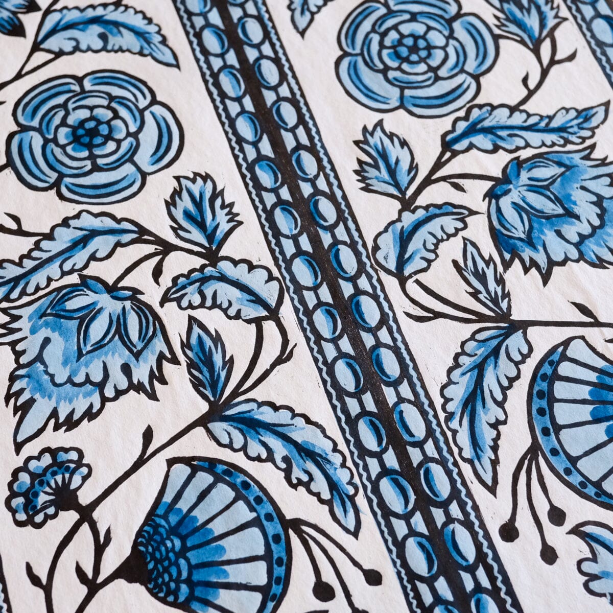
Once we digitized the design, we had two magnesium plates made, one for each color we'd be printing. Sometimes we hand-carve our designs, but since this one was never originally carved, and magnesium holds up better over time than wood, we decided to do a magnesium die. While we were waiting for the plates to arrive, we played around with color ideas, settled on a few, and then got right to printing when the plates came in the mail.
Two colors of our German Lancet Letterpress Notebooks.
Images:
https://tompress.shop/en/produkt/baden-merit-cross-of-zahringer-lion/
https://www.theviennasecession.com/paul-burck/
http://www.reinholdbrowngallery.com/landmarks02.html
https://i.pinimg.com/originals/fb/95/d0/fb95d00b2f9ec40c0f97bda5b5e00939.jpg
Sources:
https://www.tuepedia.de/wiki/Paul_Siebeck
https://en.wikipedia.org/wiki/Order_of_the_Zähringer_Lion
https://www.mohrsiebeck.com/en/about/history
http://www.visual-arts-cork.com/history-of-art/vienna-secession.htm
Comments will be approved before showing up.
October 21, 2024 2 Comments
September 23, 2024
August 16, 2023
Sign up to get the latest on sales, new releases and more…
© 2024 Papillon Press.
Powered by Shopify